What Defines Accessibility?
Let’s begin with the essentials. First, we need to understand what digital accessibility is. In a broader context, it means designing a website in a way that lets any user fully enjoy it. So, don’t think of accessibility as only for people with disabilities.
Always think of individuals who:
- Have poor connectivity. i.e., cannot use all webpage resources.
- Experience situational limitations (bright lights, excessive noise, etc.).
- Have temporary inabilities (a broken arm, surgery recovery, etc.).
- Are a part of the older population.
Each category has unique needs. And if your page accommodates them, it translates to broader reach and social responsibility.
What Is an Accessible Website?
Now, what exactly defines a page as accessible? Accessibility hinges on four core principles: perceivability, operability, understandability, and robustness. So, to be accessible, your product needs to be POUR:
- Perceivable – users must easily interpret the information and UI components independent of the senses they rely on. For example, users with low vision or relying on screen readers will benefit from text alternatives for images, videos, etc.
- Operable – users can freely use interface components and navigation, including via assistive technologies (ATs). People with limited mobility should be able to explore your site, fill out forms, and activate buttons using alternative navigation, such as a keyboard, joystick, and more.
- Understandable – users can grasp and remember your website’s information and operations. So, you ought to use descriptive, concise headings and organize content logically. This helps individuals with, for instance, cognitive disabilities to grasp the layout and find needed info.
- Robust – users and people depending on ATs can reliably interpret your page’s content. In other words, your page should be compatible with a wide range of browsers and ATs. This way, you’ll avoid “open and close” actions on your page, as consumers will be able to actually use the website.
What Your Website Accessibility Testing Checklist Should Consider
To try to imagine how a disabled person may use a website is to get it wrong. When you want to compile scenarios that will help your team conduct thorough accessibility testing, you need three things:
- Lots of research (accessibility regulations, studies, etc.).
- Real-life experiences (feedback from users, employing disabled testers, etc.).
- Authentic tools (use ATs to see how everything really works).
Preparing for accessibility checks is rather individualized. You need to know your local laws, audiences, and the product. But try to be proactive and focus on the prevalent needs of people with disabilities. Start narrow and branch out from there.
- Vision. Users with visual impairments may struggle with websites that lack alternative text for images, have low color contrast, or use complex layouts that screen readers cannot interpret.
- Hearing. Deaf or hard-of-hearing users may encounter challenges when there are no captions for audio content or when critical information is conveyed solely through audio.
- Mobility. Users with mobility impairments might find it difficult to navigate websites that lack keyboard accessibility or have overly complex navigation structures.
- Cognition. Individuals with cognitive disabilities may struggle with websites that have complex language, confusing navigation, or lack clear instructions.
- Speech. Users with speech difficulties may face obstacles when websites rely solely on voice commands for navigation or interaction.
Also, remember something that isn’t brought up often. A critical aspect of accessibility testing is that it’ll produce mediocre results with automated QA. If you want your site to be really inclusive, you need experts in manual software testing.
Accessibility Regulations
One of the best ways of ensuring accessibility is adhering to respective guidelines. Let’s overview the most widespread regulations you should get to know.
- WCAG (Web Content Accessibility Guidelines). This international standard provides a comprehensive set of rules for making web content more accessible.
- USA’s ADA (Americans with Disabilities Act) + Section 508. These prohibit discrimination against people with disabilities and mandate federal agencies to make their electronic and information technology accessible to all.
- EU’s Directive – EN 301 549 sets accessibility requirements for ICT (Information and Communication Technology) products and services, ensuring a harmonized approach across European countries.
- Germany’s BITV 2.0 (Barrierefreie-Informationstechnik-Verordnung) outlines specific accessibility requirements for public-sector websites and their mobile applications.
- Accessible Canada Act (Bill C-81) + AODA aim to create a barrier-free digital space, setting standards for accessibility in Ontario.
- UK’s Equality Act requires service providers to make reasonable adjustments to ensure accessibility for individuals with disabilities, promoting equal access to goods, services, and information.
Even with extensive regulations, there’re still plenty of cases when companies fail to provide suitable experiences for their users.
- For example, in 2006, the National Federation of the Blind (NFB) filed a class-action lawsuit against Target. The case stemmed from the fact that the retailer’s website was inaccessible to blind users.
- In 2011, Netflix faced a lawsuit filed by the National Association of the Deaf (NAD). The complaint alleged that Netflix’s streaming service lacked proper closed captioning.
- And in 2016, Guillermo Robles, a blind man, filed a lawsuit against Domino’s Pizza. He claimed that the company’s website and mobile app weren’t accessible to screen-reading software.
In 2022 alone, the US has seen 2,387 accessibly related lawsuits. The one good thing that came out of all these cases was that each company improved its services to cater to differently-abled people. So, pay close attention to regulations and treat accessibility testing as essential.
Accessibility Testing Checklist
A quick note – this web accessibility testing checklist is, of course, not complete. We’ve included the core aspects that must be secured to make most users as comfortable as possible. You may need to expand it, considering the website’s particularities.
Alternative Navigation
Not all people rely on traditional mouse and keyboard inputs. Your page needs to support diverse navigation methods. Otherwise, users simply won’t be able to benefit from your services.
In this regard, accessible navigation means:
- Interactive elements that can be used via a keyboard.
- Users can navigate efficiently using keywords or shortcuts.
- The website is compatible with voice commands, gesture-based, eye-tracking, and switch devices, and others.
Supported Screen Readers
Many depend on screen readers for their daily routine. This software works by reading aloud the content of a website, including text, links, and other elements. Individuals then use their preferred navigation method to interact with the content. So, screen readers are closely tied to alternative navigation tools.
Thus, you need to:
- Verify that all content, including text, images, and form elements, is correctly interpreted by screen readers.
- Use proper HTML tags to enhance the structural understanding of content by screen readers.
- Implement Accessible Rich Internet Applications (ARIA) attributes to provide additional information to screen readers.
- Specify the language of the content using the “lang” attribute in the HTML tag for better screen reader support.
Visible Focus States

Source: UX Planet
Focus states indicate which element is currently active or selected. Basically, users need them to perform actions on a page (scrolling, pressing buttons, etc.). And each such action must be easily grasped by a person, so:
- Ensure that focus states are visually distinguishable.
- Confirm that all interactive elements can be navigated using the keyboard.
- Verify that the focus order follows a logical sequence for efficient keyboard navigation.
Descriptive Image Text


Sources: Tiny & ineqe
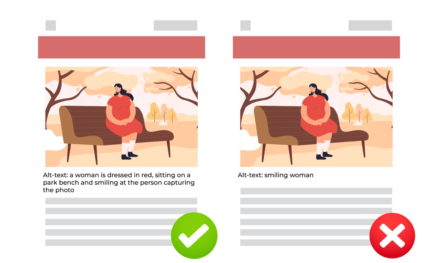
It’s not always true that a picture is worth a thousand words. People with impaired vision will not gain much from a perfectly designed infographic, as screen readers won’t “read” a photo. Hence, you need to:
- Confirm that every image has descriptive alt text.
- Ensure alt text provides meaningful information about the image’s content.
Adjustable Animations

Source: Access Guide
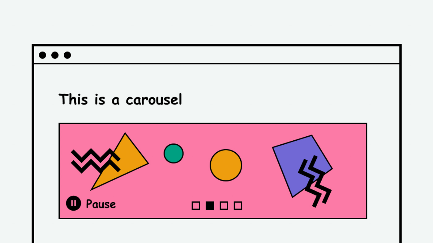
Excessive or rapid motion can be disorienting for users with certain conditions, such as vestibular disorders and epilepsy. And for some, flashing or blinking elements may cause pain. To avoid user discomfort:
- Omit rapid or distracting animations.
- Provide options to pause, stop, or time moving elements in case active visuals are needed.
Flexible Color Schemes & Filters

Source: audioeye
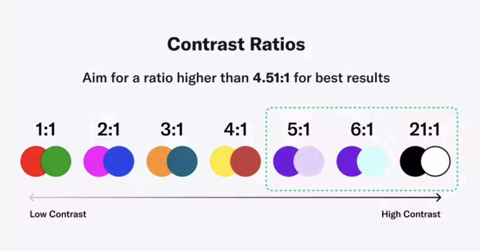
Color is often a part of brand identity. But ensuring sufficient contrast and avoiding certain hue combinations will help users with visual impairments. WCAG 2.0 states that for the highest level of accessibility compliance (AAA), the contrast ratio must be at least 7:1. So, aim for that and:
- Verify that text and interactive elements have adequate contrast against their background.
- Be cautious with color combinations that may be challenging for users with color blindness (e.g., red and green).
- Offer filters that overlay your page for better visibility if you want to preserve brand colors.
Customizable Text

Source: GitHub
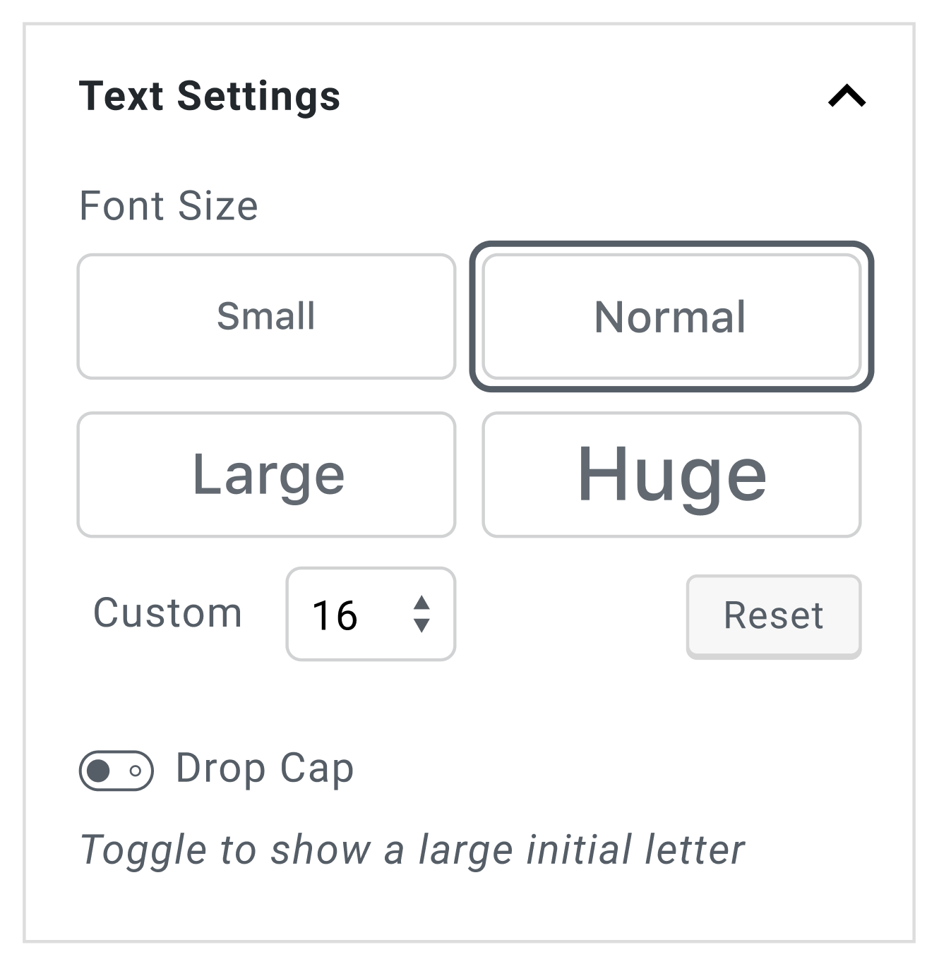
No matter how valuable your content may be to people, if they can’t read it, they won’t use it. Adjustable text is about comfort. So, you need to offer a degree of flexibility when it comes to text size, fonts, and colors.
- Confirm that users can adjust font styles to their preferences.
- Check that text can be resized without loss of content or functionality.
- Secure higher contrast rations for text.
- Ensure that the website is accessible and usable across various devices and screen sizes.
Easy-to-Grasp Forms & Labels

Source: Marvel
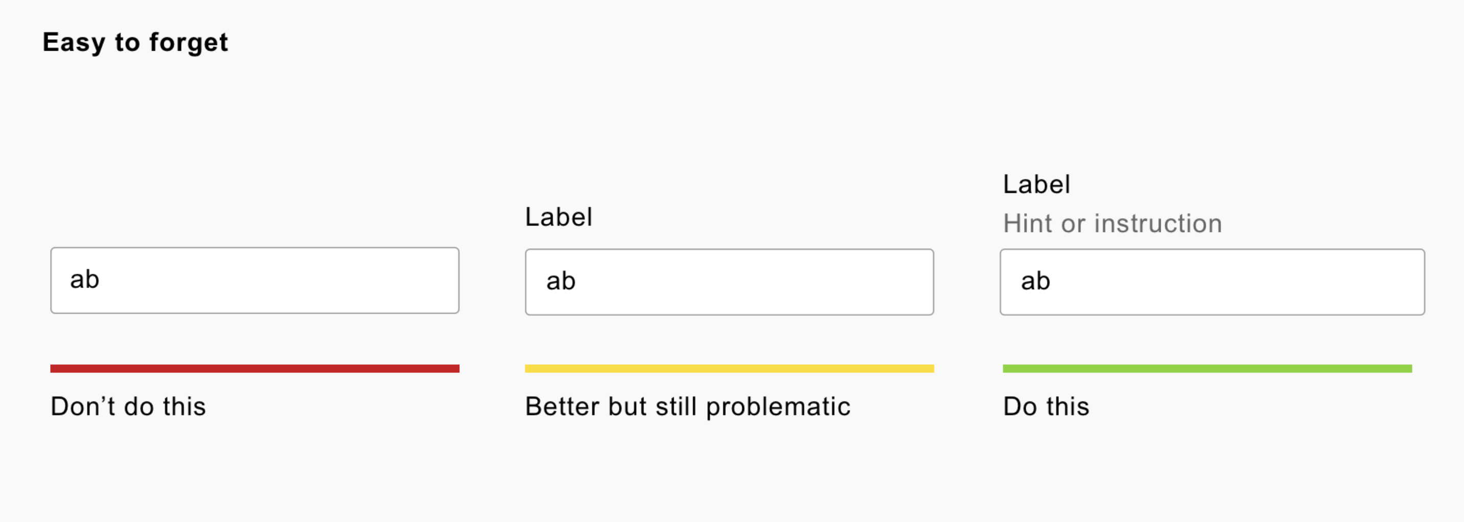
Forms are common interaction points. Proper labeling and organization assist users with screen readers or cognitive impairments in understanding and completing forms. Don’t strive to achieve a very clean or minimalistic look, instead:
- Ensure each form field has a clear and descriptive label.
- Include placeholders (explanations or examples of what info is needed).
- Confirm that form controls are keyboard accessible and focusable.
- Ensure error messages are clear, descriptive, and provide guidance on how to correct issues.
Multimedia Alternatives

Source: W3C
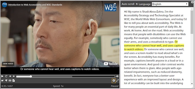
Some users may not be able to access multimedia content. Providing textual alternatives to, say, videos is great for people who need them and for your SEO as well. And just a heads up – don’t trust auto-captioning too much.
- Include transcripts for audio content.
- Add text descriptions or captions for video content.
- Offer text or audio alternatives for silent videos (e.g., a demonstration of how to install software).
Logical Page Titles & Headings

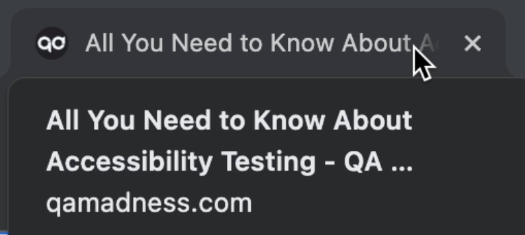
Clear page titles and hierarchical headings assist all users in understanding a page’s structure and content. For example, people who use screen readers or have cognitive disabilities will be able to quickly grasp what the site is about or whether it has the needed data. Neat structures will also improve UX across devices.
- Ensure each page has a descriptive and meaningful title.
- Verify that headings follow a logical hierarchy for easy navigation (e.g., H1, H2, H3, etc.).
- Maintain a consistent and predictable layout throughout your website.
- Include a “Skip to Content” link for users who rely on screen readers to bypass repetitive navigation.
Predictable Link Descriptions & Behaviors

Descriptive and clear links are not only a matter of good design. They are a fundamental aspect of digital accessibility. So, you want to make sure that each link on your page lets users know what to expect. And people who use ATs will have an easier time giving instructions to, for instance, a voice command tool.
- Ensure link text provides clear information about the linked content.
- Check that link behavior is consistent throughout the website.
To Sum Up
A final point that we’d like to note is to not get hung up on digital accessibility as an advantage for business. Sure, you’ll get quite a few perks by making your webpage inclusive: better performance, reputation, risk mitigation, refined UX… But don’t forget that there are real people who you can make happy by implementing a few tweaks to your page.
Treat digital accessibility as something that makes our world better, and work with professionals who know what they are doing. QA Madness can help with that.
Ready to discuss accessibility testing
for your website?
Let’s talk


