What’s the Difference between UX Accessibility vs Technical Accessibility?
Imagine a lovely vacation booking site. It supports assistive tech, nails down focus states, offers detailed alt text — the works. Now imagine a person using a screen reader having to go through dozens of pretty pictures that adorn the app and listen to lengthy descriptions for all of them. They’ve spent too much time “enjoying” the technical accessibility. And no time having a good experience. And that “Search” field the person was actually after — never even reached.
It’s like saying, “Hey! Here’s a door you can open with your hand, by whistling, or using a button”. Yet, behind that door is a brick wall. So what is accessibility in UX design? It’s the lack of brick walls.
You can think of compliance and accessibility in ux design as functional and non-functional testing.
One asks, “Does this work?”:
- Can you navigate a site using a keyboard?
- Does the page offer error messages?
- Does the text resizing function?
The other asks, “How does this work?”:
- Does the focus state get stuck or jump unpredictably?
- Are the error messages clear and helpful?
- Does the text resizing mess up the page layout?
Any app can be functional or technically compliant. That’s the bare minimum. Making an app that’s genuinely pleasant to use is a different bar — and the one that actually matters.
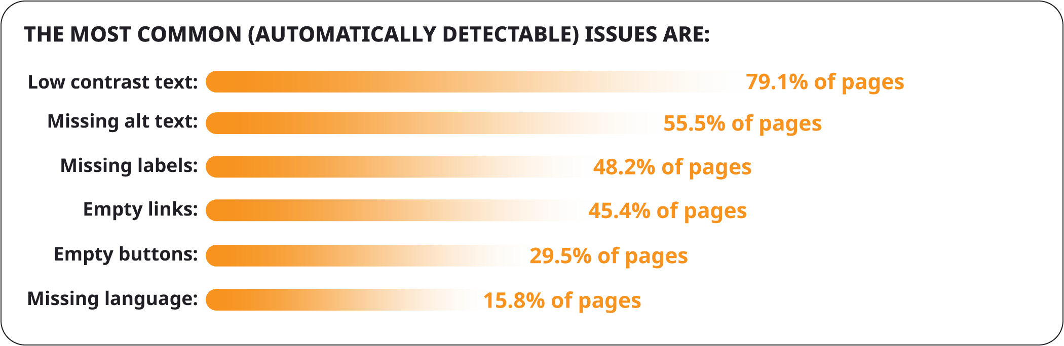
The problem is that most digital products don’t even meet that baseline. A large-scale study that ran automated accessibility scans across one million websites found that nearly 95% had WCAG failures. And most of them were tied to basic design choices, not edge-case bugs.

That’s why accessibility doesn’t work as an add-on. It should be baked into core UX decisions, naturally translating to user experiences.
Accessibility UX belongs in product design, not patches or fixes.
What Are the Core Accessibility UX Design Principles?
The UX accessibility standards are based on POUR principles. If you researched WCAG Accessibility Audit, you know them. A product must be:
- Perceivable (a user must be able to“sense” your product, whether through sound, text, or touch).
- Operable (a user must be able to interact with your product, whether via a mouse, keyboard, or assistive tech).
- Understandable (a user must be able to “figure out” your product, i.e., familiar layout, logical navigation, explanatory clues, etc.).
- Robust (a user must be able to access your product, whether they use older devices, OS versions, etc.).
These make up the UX accessibility guidelines. The issue is that teams may look at them as “functional” aspects. And some choose or are unable to perceive them in another way due to lack of expertise, time, resources, or awareness. Here’s an example.
- A text-to-speech tool user might be able to navigate your page. But they have to jump through hoops to do so. Technically perceivable. But disregards UX design accessibility.
- A user might be able to interact with your site via a keyboard. But there are focus traps and invisible buttons.
- A user might be able to submit a form. But background animations and auto-updating content shift focus unpredictably, causing confusion and errors.
- A user might navigate an interactive widget. But it’s built with custom elements that work in some browsers but aren’t recognized correctly by screen readers in others. Again. Technically compliant. In reality, demonstrates limited accessibility UX research.
So, let’s approach accessibility testing services with UX in mind.
UX Accessibility Checklist
Let’s take a look at the WCAG checklist through the prism of user experience.
Perceivability
Let your content be noticed without struggle.
Text Contrast & Color Usage
Meeting the minimum contrast ratio isтєе enough. Users must easily distinguish foreground from background in all conditions, including bright daylight, screen glare, or low vision. Also, information should not rely on color alone. For example, marking required fields in red should also include an asterisk or label text. Users should never have to guess what color means.
Text Alternatives for Images
Alt text should communicate the purpose of the image, not just describe it literally. For instance, a button with a shopping cart icon should be labeled as “Add item to cart”, not “shopping cart”. Descriptions should also be concise enough for screen readers to read quickly. Users should be able to skip through long lists of images without being trapped in long audio explanations.
Multimedia Captions & Transcripts
Captions must be synchronized, concise, and skimmable, conveying spoken content and important non-verbal cues. Large blocks of captions or transcripts can overwhelm users. They should be able to navigate freely and control playback speed. Improving UX accessibility for disabled users means considering their needs. Not what the EAA demands.
Adaptable Content
Content should adjust to user needs — resizing text, zooming, or changing display modes — without breaking layouts or hiding information. For example, a table should remain readable when zoomed 200%. And headings should maintain hierarchy so users can scan quickly.
Distinguishable Elements
Important elements like links, buttons, or form fields must stand out visually and audibly (for assistive tech). Users should instantly recognize what is interactive and what is static. Use consistent visual cues (shadows, borders) and avoid small click/tap areas that are hard to hit.
Operability
Remove all roadblocks for user interactions.
Logical Keyboard Navigation
Users must navigate in a predictable order without focus jumping or getting trapped. For instance, a multi-step form should let users tab sequentially through fields. Modals should trap focus temporarily and release it on close. During UX accessibility testing, strive to check all flows using only the keyboard to uncover unexpected jumps or traps.
Accessible Interactive Elements
Buttons, links, and form fields must be easily located and clearly labeled with their action. For example, a trash can icon should have an accessible label like “Delete item”, not just “icon”. Ensure touch/click targets are large enough and provide clear, consistent labels.
Timing & User Control
Auto-advancing content or timed interactions should be controllable. Users need sufficient time to read and interact. For instance, slideshow carousels should have pause/stop buttons. And forms with countdowns should allow extensions. Avoid forcing users to rush. Give control over pacing.
Consistent Navigation & Predictable Interactions
Layouts and interactive behavior should remain predictable to reduce cognitive load. For example, checkout buttons should appear in the same location across all steps. Reuse familiar patterns, maintain visual consistency, and avoid unexpected shifts.
Easy Error Recovery
Users must recover from mistakes without frustration. Instead of “Invalid input”, provide “Password too short. Use at least 8 characters with one number”. Highlight errors clearly and offer contextual guidance. Allow corrections without restarting the process. These aren’t just UX accessibility best practices. It’ll improve the experience for all.
Understandability
Make your content make sense.
Clear, Concise Language
Avoid jargon or overly complex instructions. Users should understand content quickly. For example, state “Upload your ID document” instead of “Provide identification in digital format”. Write action-focused text. Test readability for diverse audiences.
Predictable Interface Patterns
Consistent layouts and behaviors are at the core of UX accessibility. They help users build mental models. Buttons performing the same function should look and behave the same across screens. Avoid random repositioning of interactive elements.
Informative Feedback & Error Messages
Users need guidance on what went wrong and how to fix it. “Email address missing @ symbol” is more actionable than “Invalid input”. Provide context-specific, concise instructions for correction.
Support for Cognitive Load
Reduce memory burden by showing instructions, hints, or step indicators inline. Multi-step forms with progress indicators help users understand where they are and what’s next. Keep information visible. Don’t force users to recall instructions from previous screens.
Robustness
Prepare your app for authentic usage.
Cross-Device Consistency
Users should have a reliable experience whether on desktop, mobile, or tablet. Inconsistent behavior can confuse or slow them down. Interactive elements should work the same way when resizing screens or switching devices. Check navigation, gestures, and layout across devices to ensure intuitive interaction.
Avoid Unnecessary Friction from Accessibility Features
Accessibility considerations in UX design should help, not hinder, the user experience. Features like auto-focus or overly verbose ARIA announcements can disrupt workflow. For instance, a modal that traps screen reader focus for too long can block users from moving forward. Keep users in control and avoid introducing barriers with accessibility features.
Real User Testing
Technical compliance doesn’t guarantee usable accessibility. Include real users in your QA accessibility testing to identify pain points and improve overall experience.
Remember that in an accessibility audit, UX plays a bigger role. You can secure WCAG compliance level AAA and still have people falling off your app. You really need to consider how each feature impacts actual users, not just how many success criteria you’ve completed.
How to Implement Accessibility in UX Design?
To make sure there are minimal do-overs, retrofits, and overhauls, especially at the last minute, you should shift your accessibility UX strategy left.
Issues discovered in production aren’t just harder to correct. They force teams to rework layouts, interaction patterns, and sometimes entire flows that were already signed off. Fixing the same problems at the design stage takes a fraction of the effort and avoids downstream trade-offs between compliance, usability, and delivery timelines. Shifting accessibility left is about protecting UX decisions before they harden into code.
This starts during wireframing, where accessibility should be part of UX critique, not a separate audit step. At this stage, teams can evaluate whether:
- Navigation flows make sense without a mouse.
- Focus order follows user intent.
- Key actions remain discoverable when visual cues are removed.
These questions are difficult to answer once the interface is fully built. But they are relatively easy to address when interactions are still flexible.
Automated design plugins such as Stark or Axe for Figma are useful at this point. But only when their role is clearly understood. They are effective at catching measurable UX accessibility issues like insufficient color contrast or missing alt text. Used early, they help designers course-correct before patterns are reused across the system. Yet, remember that automated tools can’t assess whether the interface logic actually works for assistive tech users.
That gap is where human judgment becomes essential. Designers and accessibility reviewers need to manually evaluate if components communicate purpose, states are distinguishable without relying on color alone, and interaction patterns remain predictable across screens. These checks aren’t about WCAG interpretation. They are about anticipating real user behavior and friction.
To make this work at scale, accessibility expectations should be defined before design handoff, not inferred during development. Annotating designs with accessibility intent, such as heading hierarchy, keyboard interaction patterns, or required ARIA attributes, gives developers clarity on what to preserve in implementation. More importantly, it anchors accessibility in UX decisions, rather than leaving it to be reconstructed later in code.
When accessibility is designed deliberately, not retrofitted, compliance becomes a by-product. And usable, enjoyable experiences are far more likely to follow.
UX Accessibility Testing That Works in the Real World
Another strategic matter is how to do accessibility testing manually. You cannot simulate the daily reality of a blind user by turning off your monitor or navigating with a keyboard for a few minutes. Assistive technologies aren’t just alternative inputs. They fundamentally reshape how an interface is perceived, paced, and understood.
This is especially clear with screen readers such as NVDA or VoiceOver. A visually clean interface may appear perfectly structured to sighted users, yet sound disordered or overwhelming when announced aloud. If the DOM order doesn’t match the visual hierarchy, users are forced to navigate content in a sequence that feels illogical, repetitive, or exhausting.
These accessibility UX design issues are rarely flagged by automated checks. But they become immediately obvious when someone actually listens to the interface and tries to complete a task using a screen reader as their primary way in.
Manual software testing is equally critical when considering cognitive accessibility and neurodiversity.
- An interface that technically meets accessibility guidelines may still demand excessive focus, rely on dense text, or introduce unnecessary decision points.
- For users with ADHD, this can make it difficult to stay oriented or complete a flow without losing context.
- For users with dyslexia, unclear hierarchy, inconsistent labeling, or tightly packed content can slow comprehension and increase fatigue.
These aren’t edge cases. They are everyday UX barriers that only surface when teams observe how different users think, read, and navigate.
Including real users in accessibility testing shifts the conversation from “does this pass?” to “does this work for someone who depends on it?” That perspective is what turns UX accessibility from a compliance exercise into a design quality signal.
Bridging the Gap between Accessibility in UX Design & Compliance
Many teams already have strong designers and capable developers. Yet accessibility still breaks down in the gaps between them. WCAG requirements are often interpreted differently by each role, which leads to technically correct implementations that fall short in real use. In fact, difficulties in aligning processes are the most cited reason for achieving proper UX accessibility.
What’s usually missing is a translator — someone who understands UX accessibility standards well enough to map it to design intent, interaction logic, and user behavior.
Our accessibility audit UX services are built around that connection. They’re a part of our broader UI Testing Services, designed to evaluate interfaces the way users actually experience them.
We assess both the technical implementation and the lived experience, because accessibility failures rarely exist in only one layer. Code-level issues such as missing semantics or incorrect focus handling often translate directly into usability problems. While UX decisions made in design can introduce barriers long before a single line of code is written. Evaluating both together allows teams to fix root causes rather than symptoms.
In practice, this means hands-on testing with the same tools real users rely on. Our senior QA engineers navigate interfaces using screen readers and keyboard-only interaction to uncover blockers that automated scans miss.
We also work upstream, reviewing prototypes and early design artifacts to identify UX accessibility risks before development begins. Catching problems at this stage prevents inaccessible patterns from being scaled across the product. And it gives designers concrete guidance they can act on immediately, without slowing delivery.
Finally, we help teams turn findings into a practical accessibility strategy. That includes:
- Aligning design and development decisions with EAA requirements.
- Prioritizing fixes based on user impact.
- Improving flows that directly affect conversion and task completion.
The goal isn’t just compliance. But interfaces that more users can understand, trust, and successfully use.
To Sum Up
Accessibility is the baseline of modern digital quality. Products that consider UX accessibility reach more users, perform better in search, and avoid unnecessary legal risk. Checking both the technical side and the user experience helps teams spot real blockers early, fix them efficiently, and make sure the product works well for everyone.
Having a solid accessibility audit supported by QA services means issues get caught before they become costly, and improvements are grounded in real UX. It’s not about ticking boxes. It’s about making your product usable and reliable. If you’re looking to strengthen your product’s accessibility, QA Madness can help you connect design, development, and compliance without extra stress.
Strengthen your product’s accessibility
Contact us