Don`t Question Responsive vs Adaptive Design: Focus on Product Quality
Reading Time: 5 minutes
We see no point in debating the topic, just treat it like product development, define your goals, establish website quality assurance strategy, and measure your progress.
The area of web design & development is getting to the point where it has become almost impossible to keep up with endless device versions hitting the market. And the tendency evolves. As a result, creating a separate website version for each resolution is not always possible. But ideas are shaping along with the technology growth.
Responsive Web Design
No need to lose visitors from a mobile device for the sake of PC users as long as responsive design exists. This type refers to the graphical user interface that smoothly adjusts to different screen resolutions. But the key feature of a responsive website is its versatility. With the ability to respond to screen size changes, the interface adjusts the placement of design elements to optimally fill the space. In fact, this is one single layout that automatically adjusts to the device used.
Since mobile access to the Internet has long become more popular than via laptops, responsive design creation focuses on smartphone & tablet experiences and then move to a larger scale.
How it works?
The RWD practice is a combination of grids, images, layouts, and the application of CSS media queries.
- Flexible Layout is that adaptive grid we`re talking about here. This is the component dynamically resizing to any width.
- Media Queries assign the style to a page taking into account the device type, browser width & height, area for content placement.
- Responsive Images and Videos. Again, the component is about size and resolution that fit device requirements. To choose the right media quality and load time might be a tough job here.
These are the integral components to ensure the web page accommodates for resolution as soon as the user switches from a laptop to a smartphone. The idea is that the technology responses to user preferences, even for the latest gadget versions.
- RWD is coded on the handy framework to develop such web page types — Net, Java, CQ5, PHP.
- The automatic adaptiveness of RW to screen resolution and image size flexibility is achieved via HTML and CSS features.
- Breakpoints identify the layout. These are the spots where the site content responds to provide the user with the most convenient layout to surf the page.
How to Test?
The dynamic nature of responsive web might be out of control when it comes to the interface distribution. Often, intricate designs don`t translate seamlessly across the screens. And that is where quality assurance takes over the process. Browsers, resolutions, screen sizes, operating systems are the focus for QA engineer when working with responsive design.
The QA strategy might depend on a software testing company you work with, but these are the key test scenarios that ensure your website design fits RWD criteria:
- URL. The address should be the same, whatever the browser, screen resolution or device is.
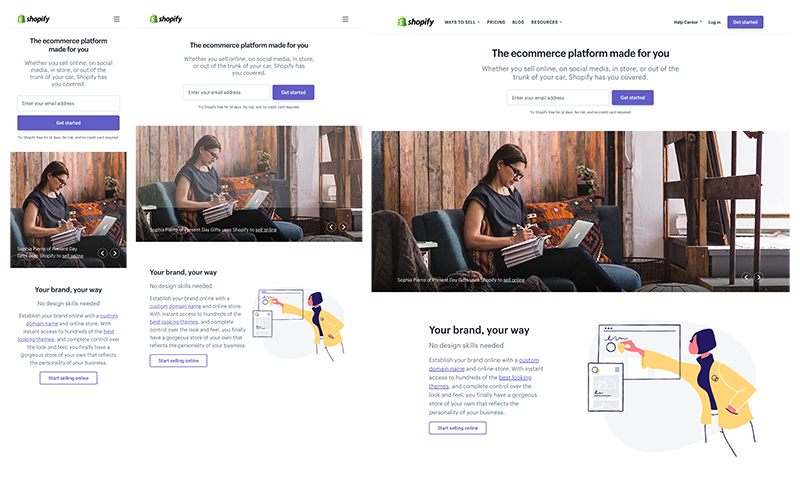
- Content. Images, sublinks, menus adapt to the device and locate per screen resolution. There is no single formula on testing this aspect, as the QA strategy always depends on the design specifics. Let`s consider the example:
Here is the way Shopify consistently adapts user experience across device range. The illustration is right near the test on PCs and tablets, while it is hidden below the copy on mobile gadgets. The hamburger icon is a typical solution for menus to be displayed on handheld devices. Placement of the call-to-action button is the most distinct feature between the versions: it is to the right on laptops and tablets, while it is beneath on the mobile devices.
- Images. RWD contains resolution-specific visuals. That means the resolution varies and depends on a device. The task of QA engineers is to check whether the resolution fit mobile, laptop or tablet requirements.
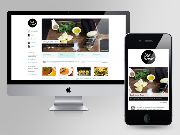
Example: Foodsense Website
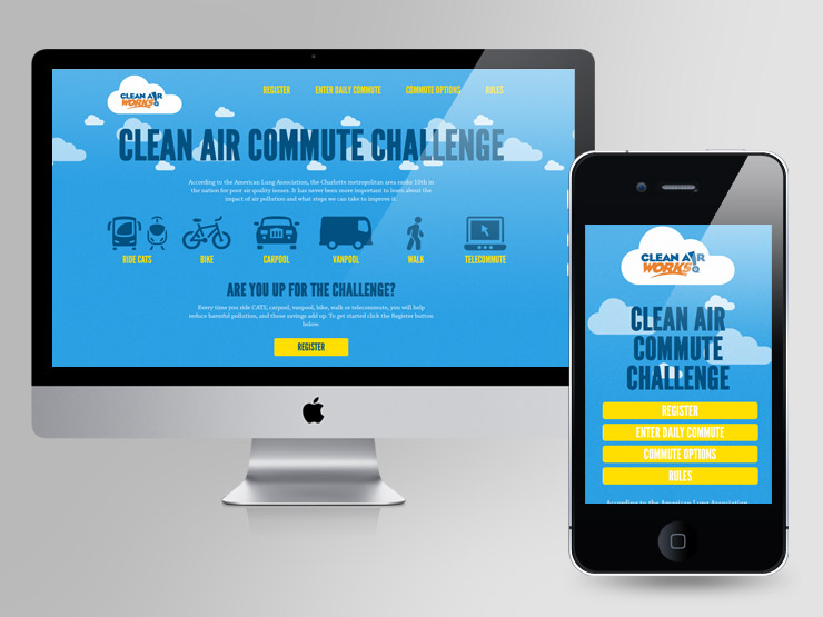
Example: Clean air challenge website
- Browser. When opening the tested RW in a browser, QA checks the contents and image display. QA specialists verify the content changes as long as the window is resized till the breakpoint to the tablet size. At breakpoints, the website parts should flexibly reshape to fit the device.
Adaptive Web Design
Similarly to responsive websites, adaptive also adjusts the layout but in a different fashion. Its performance is based on the static layouts to detect the screen size and “generate” the appropriate layout. Commonly, a designer would create a separate layout for six most typical screen widths: 320px, 480px, 760px, 960px, 1200px, and 1600px. One static layout is adjusted to particular panel size. Thus, the same page of adaptive design has six or more design versions.
Unlike responsive, adaptive is limited to the range of devices chosen for a particular project. But that has no influence on its complexity and quality assurance strategy. QA engineers would run through all the stages of graphical user interface testing and verify software compatibility with the gadgets & browsers.
Responsive vs. Adaptive
It`s good to know all of this but still…which design is better?
The choice is yours. Both approaches work well, as long as you have set the project goal. Right, the adaptive design lacks flexibility and limits website traffic to the people using a particular set of devices. However, if there is no much time to dedicate to the project, be it budget reason or deadlines, adaptive design is a valid option, especially when you rely on user data analytics. Just have a look at the numbers below. They help you to prioritize the devices most commonly utilized by the users, allowing you to ensure the way an adaptive website should be developed.
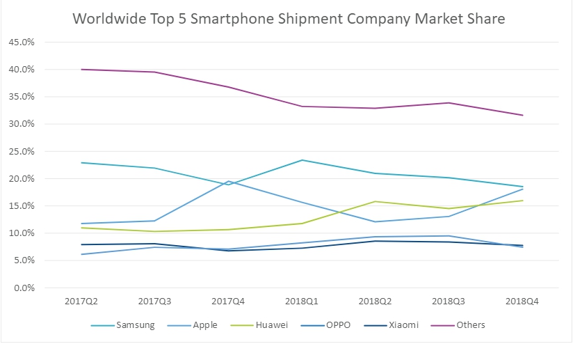
According to the IDC Vendor report, smartphone companies shipped $376.5 of units. The graph below represents the shipment share of the best-selling smartphone models until the fourth quarter of 2018 global market.
And the graph below reveals the US market share of the top-selling smartphone models compared December 2018 vs January 2019.
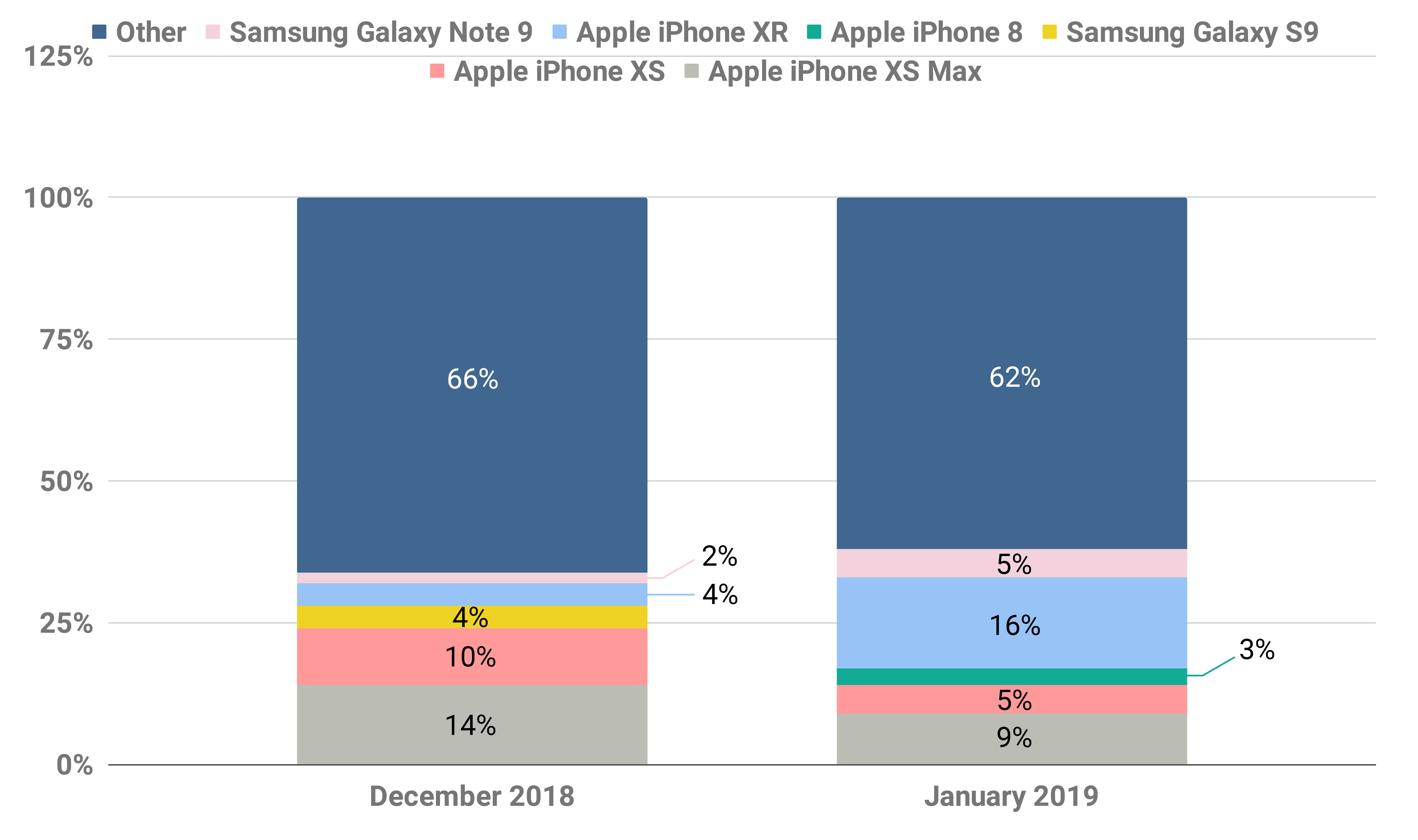
Data Source: Statista.com
You`re better off designing a responsive website from scratch to ensure smooth user experience and reach a wider audience. Sure, responsive design requires much more coding, the process itself is time-consuming. The designers would often rearrange the elements, while developers go back and forth to make sure the code is consistent with the design. Most of the websites today meet responsive design criteria since it is still hard to anticipate the devices people might use to access your site. The plastic nature of responsive design adds value to website consistency, raising brand recognition and user trust in the long-run.
Whichever path you choose to go, think over the project goals, time, budget, user preferences. Neither of design types makes too much difference, just remember the implications of each. We see no point in debating, just focus on product development and have it tested.
Good luck with your website 🙂


